— Design system for interactive visual aids
Date
2018
Roles
UI/UX
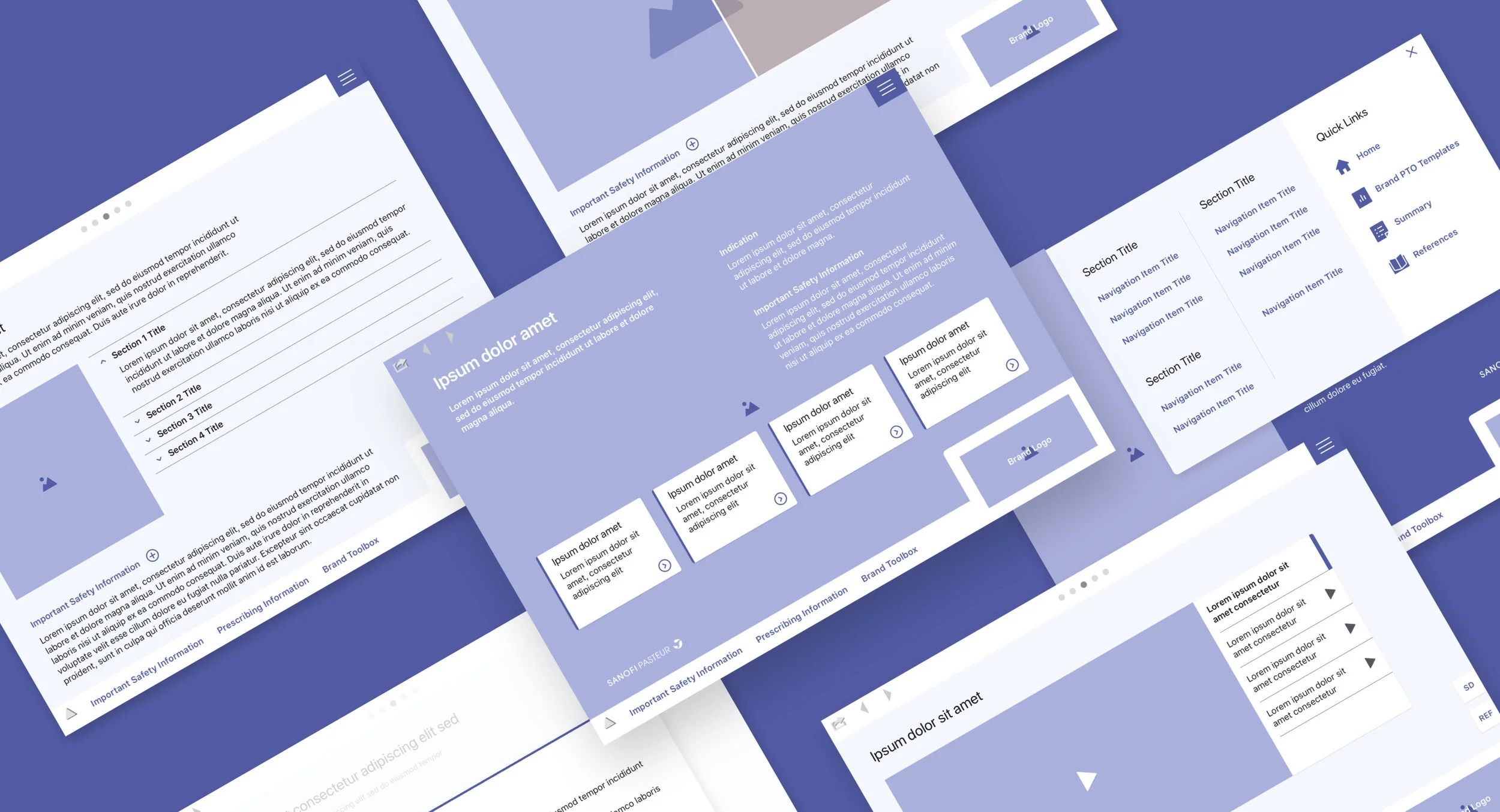
2018 was a year of significant transition for Sanofi Pasteur's reps as they started detailing doctors using digital sales aid tools instead of printed materials. Considering that most of them were representatives for multiple vaccine brands within the company's portfolio, it was important to keep the user experience seamlessly as they moved across the tools, and allow them to completely focus on the content that needed to be delivered.
I led the creation of the design system to be put in place by the company's development partners and visual design teams for each brand.
I laid the foundation for the system in four main aspects: color, typography, layer, and spacing. The default colors were based on Sanofi Pasteur's palette. These were then substituted on brand-by-brand basis. Interface and text colors remained unchanged across brands. Typography scale followed Apple's Dynamic Type Size guidelines. Title text styles were substituted by each brand's typeface.
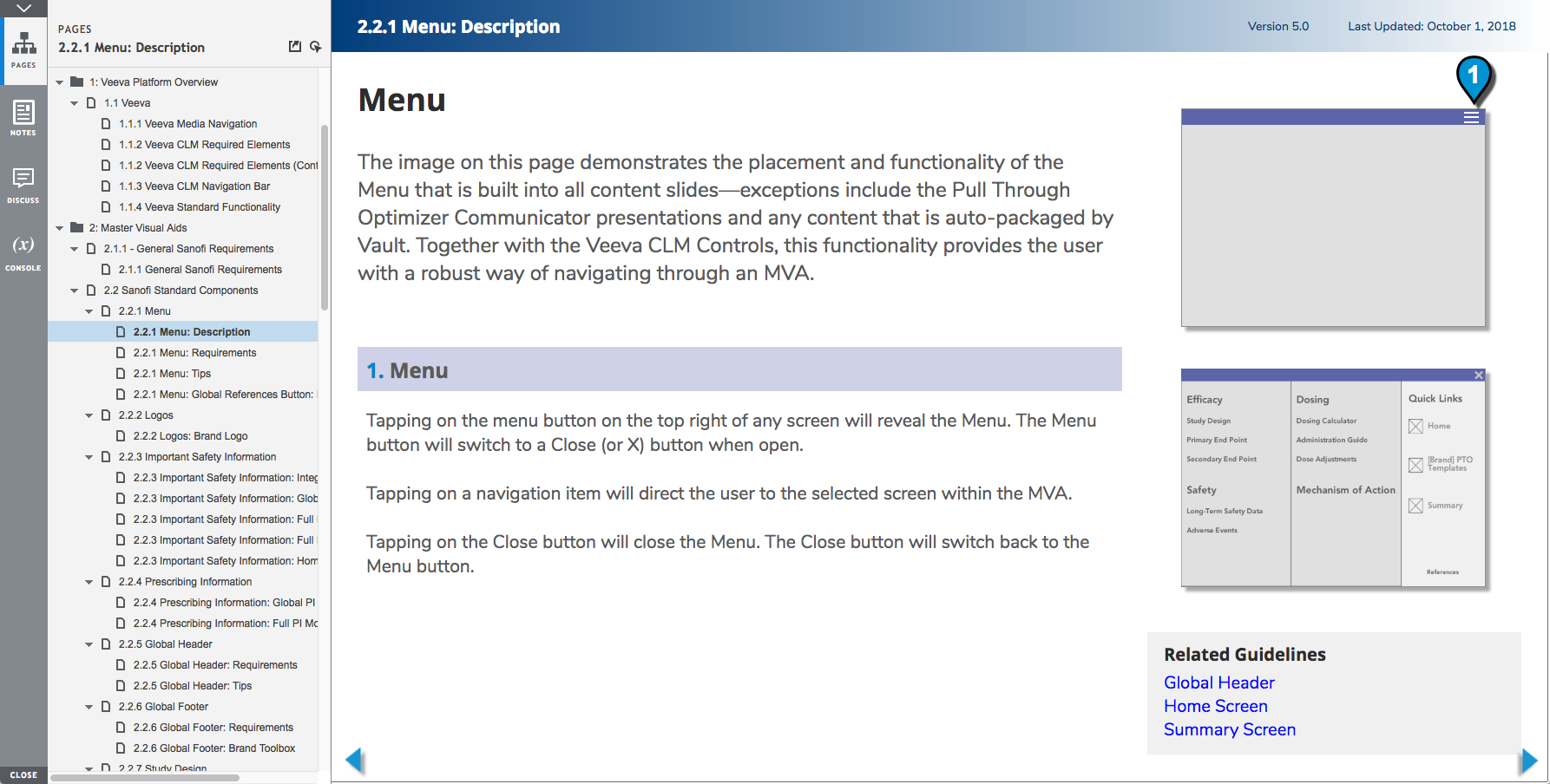
I partnered with the development team to create the right frameworks, put ideas forward, gain alignment and drive decision making.
Dozens of content templates were created to showcase the components and provide guidance to the design teams on how they can be used for the different scenarios and types of contents.